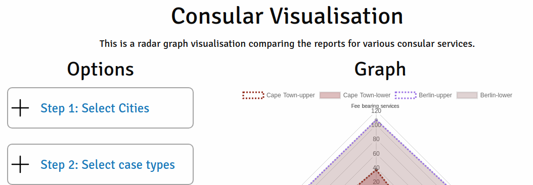
A radar chart visualisation of public consular foreign office data.
Links
Why
This was inspired by this analysis on travel danger for the US and I wanted to try something similar for UK statistics.
The data used is easily available at Link. It is stored in CSV files but the data structure changes on the Feb 2016 onwards.
I ended up using the data after this month for simplicities sake but the data before can be used. I would recommend you avoid mixing the data at least initially and then doing clean up on it to merge it. This was out of scope for me.
Firstly I created a python script to convert spreadsheets into something more useable for me. I used SQLite database for ease of use.
You can find out more on the python script used to parse the data here, it also includes data structure and example SQL queries.
I ran a few interesting queries here. For some interesting stats.
Then I kind of forgot about it until I was a radar diagram and wanted to create a visualisation for it. I remembered this dataset and thought it be interesting to compare cities.
I was trying to figure out how to structure the data and wanted to avoid using a database/api for the queries. So I ended up generating large json files with a nested key:value structure for fast lookup depending what is selected.
This allowed the dataset to be queried very quickly once loaded into the browser. The file size is quite big 12MB but perfectly useable.
The result worked as expected but the data had some categories that were much higher than others causing the data to skew the chart. Radar charts are only really good for when the results are near each other.
Tech
- Python: Data parsing
- Nuxt: Vuejs static website generator
- Chart.js + vue-chartjs: For the radar diagram
- Foundation: a little bit of scss/css
